 |  |  |
|---|
For my magazine spread design I used Adobe InDesign. It has the theme of Everest and is a 3 page spread with a 2 column grid, a 6 column grid and an 8 column grid. I incorporated an infographic that I created as a map of the route to the Everest base camp and tried different text wrapping styles. I went with a minimalist color pattern. All text was copied and used for design purposes.
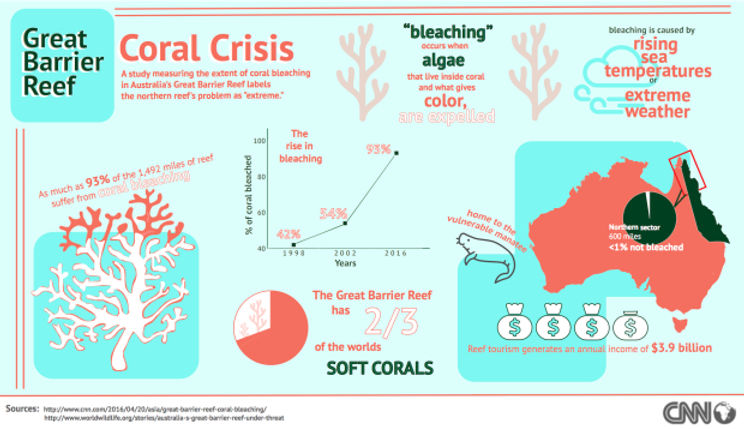
I made my Adobe InDesign infographic on the Great Barrier Reef’s coral bleaching crisis and based it off of a CNN article. I used several graphs in my infographic including a point graph, two pie charts, a map and a visual piece that was the 93% bleached coral. I went with a simple color theme and included graphics like the manatee to enhance my message.
 |  |
|---|---|
 |
Above is essentially one page that is designed using three different grids. I made these grids on Adobe InDesign. The grids top design is a 9 column grid, then a 4 column and a 3 column. All grids incorporate the same headline and image. Text is default filler text for design purposes.
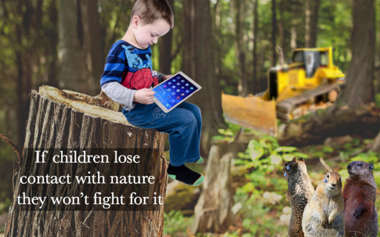
I made my editorial illustration on Photoshop to go with the headline “If children lose contact with nature they wont fight for it”. I found many different images and edited them to create an image of a kid sitting on a tree stump while too busy playing on his IPad to notice the destruction going on behind him. I had to edit the IPad in, blur and cut out the bulldozer and add tear drops to the squirrels faces.
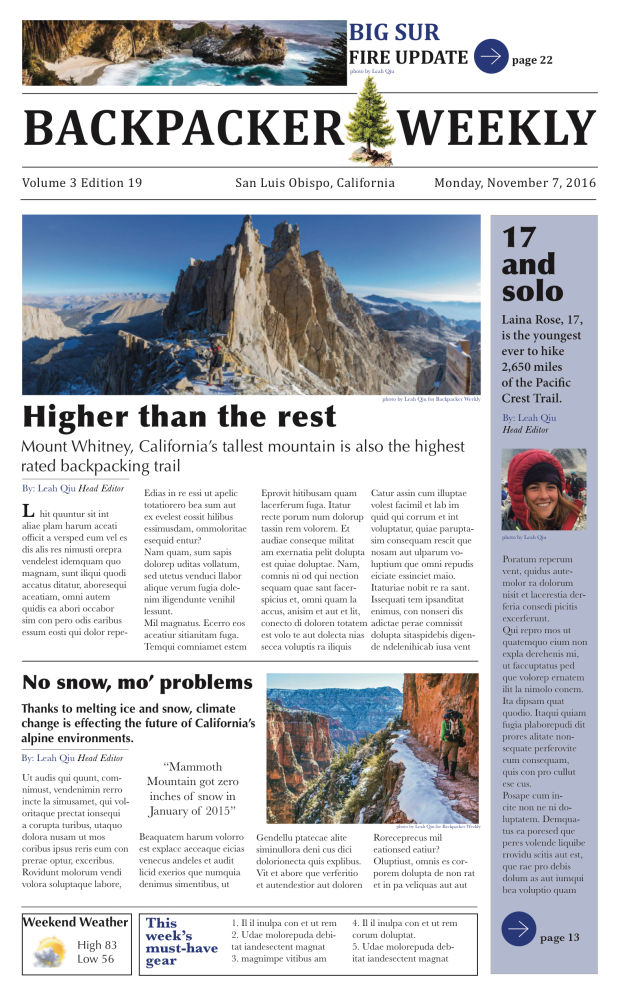
I made my Newspaper front page on InDesign. I used a simple color scheme, had three different fonts and added lots of graphics that helped emphasize the articles. I used “cambria” for the flag font. I also made the top “big sur” headline cambria and the date, edition and location. For the rest of my headlines I used the Sans font “optima”. For the body text I used the Serif font “baskerville. I added lots of graphics to bring my newspaper together. I added a top image of big sur to the top banner. Also on the top banner I created a graphic to go with my jump line. I used this graphic for another jump line in my side bar. I added a little tree to the flag and made the top go above the line. I added a huge image of Mt. Whitney for my focal point graphic. Text is default filler text for design purposes.